Blackout 2003
Infographic
Fall 2017
Fall 2017
20’’ × 32’’, Inkjet printing, Epson Enhanced Matte Paper
Adobe Illustrator+Adobe InDesign
General layout design/Narration/Icon drawing/Graph drawing
Adobe Illustrator+Adobe InDesign
General layout design/Narration/Icon drawing/Graph drawing
Works in a team to clearly and concisely tell the story of the Blackout of 2003 in a large-scale infographic.
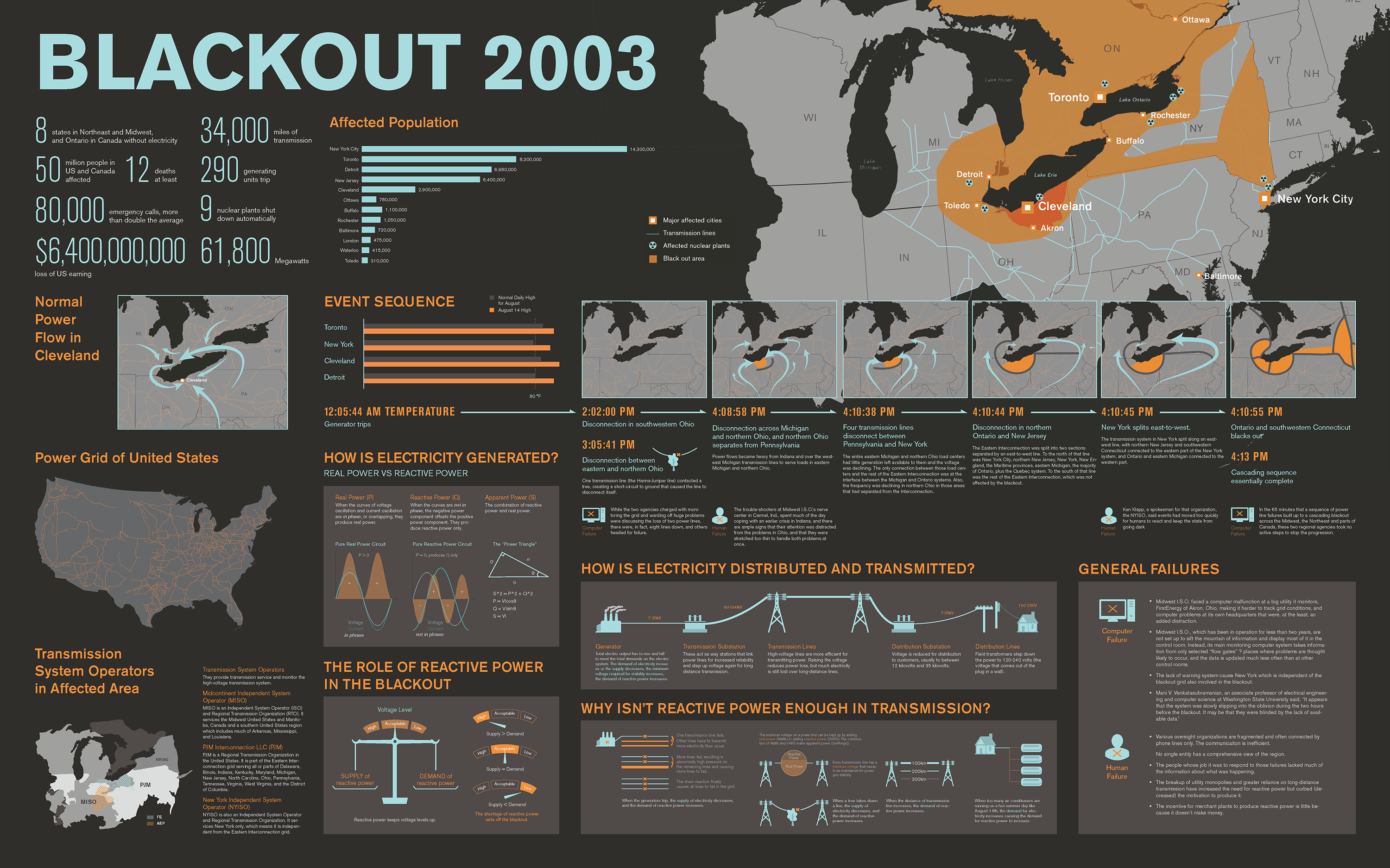
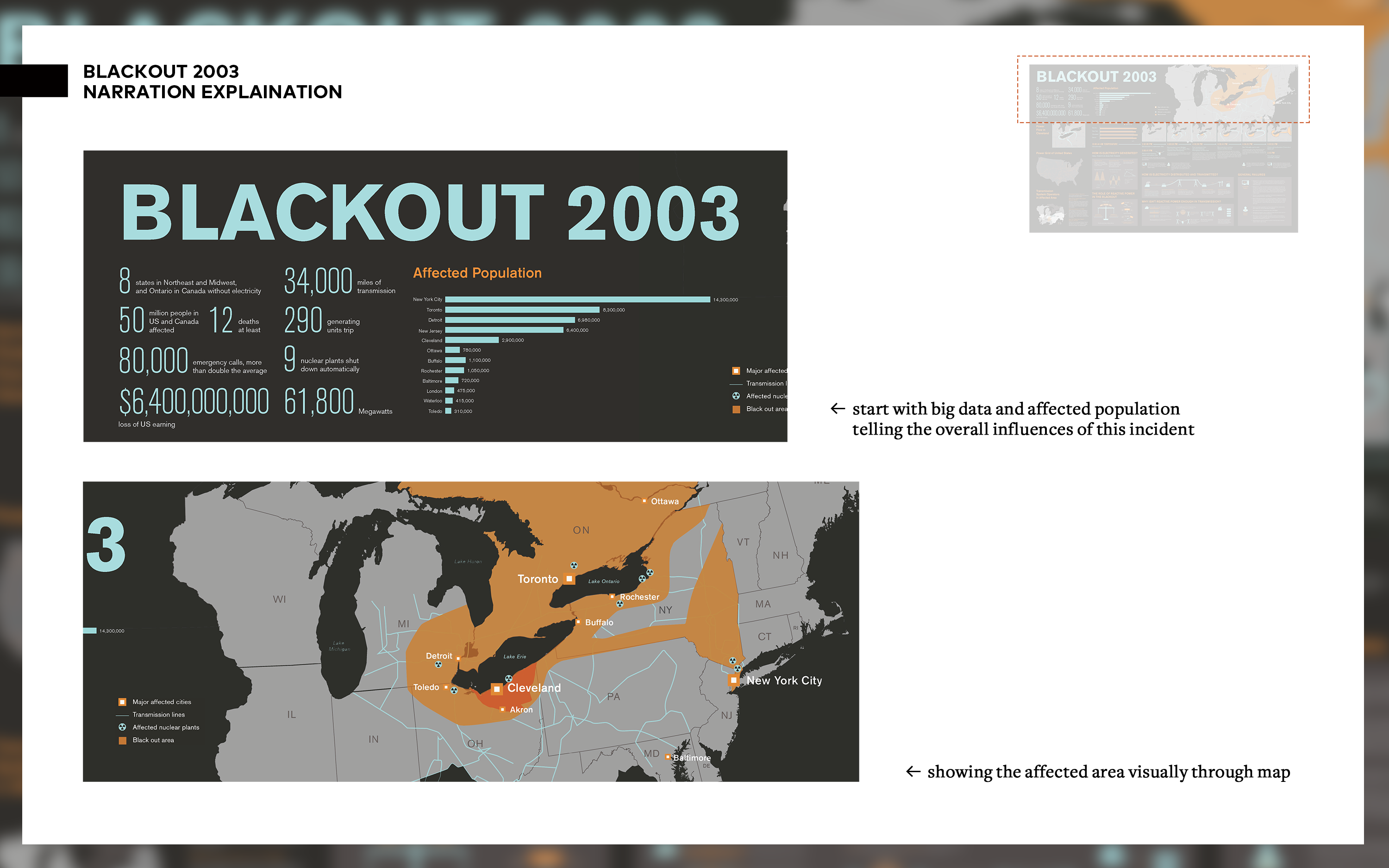
The infographic provides overall results of the event first. It begins with a large title “Blackout 2003” with big data, a bar graph of the affected population, and the final affected areas as the results of this incident.
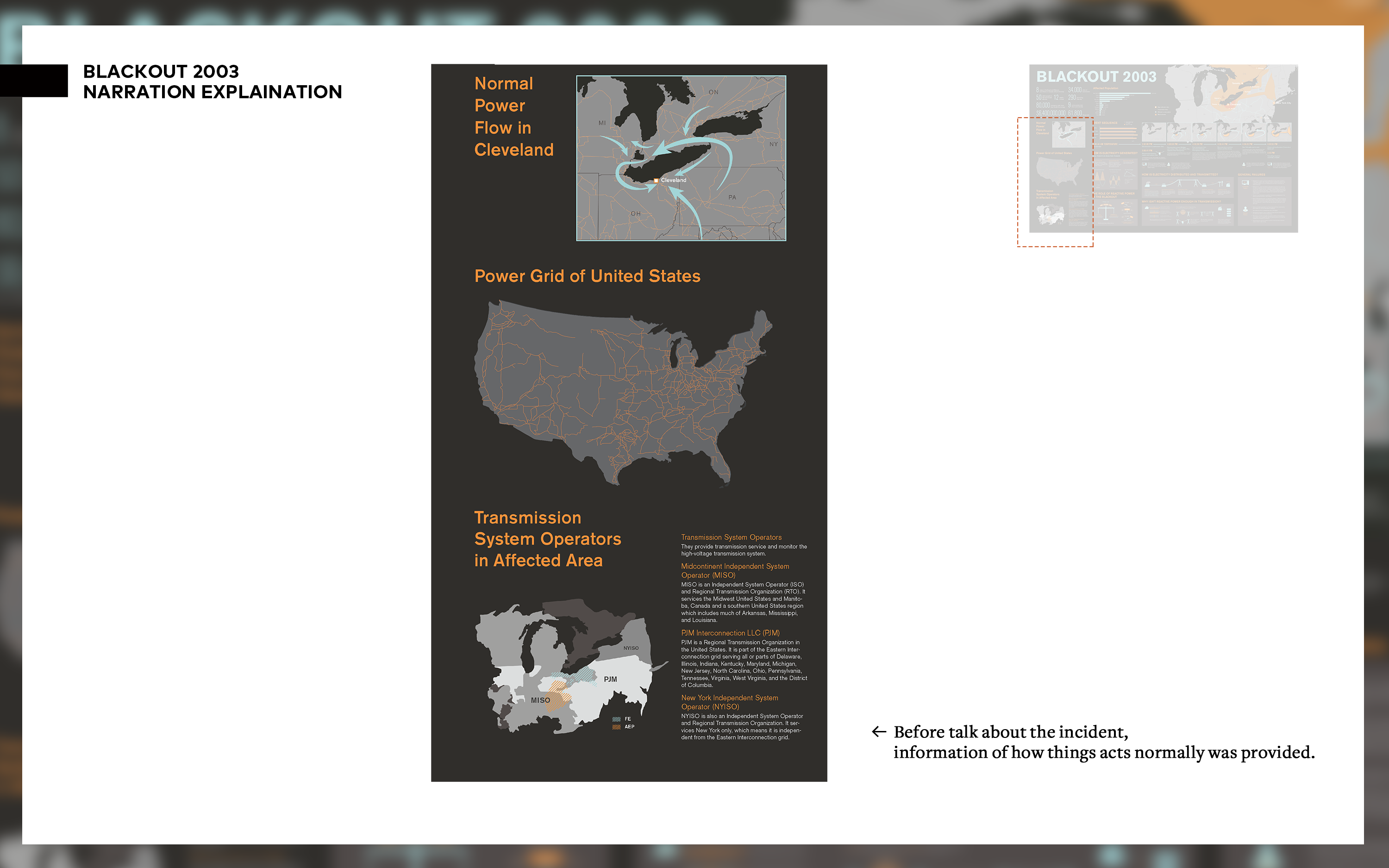
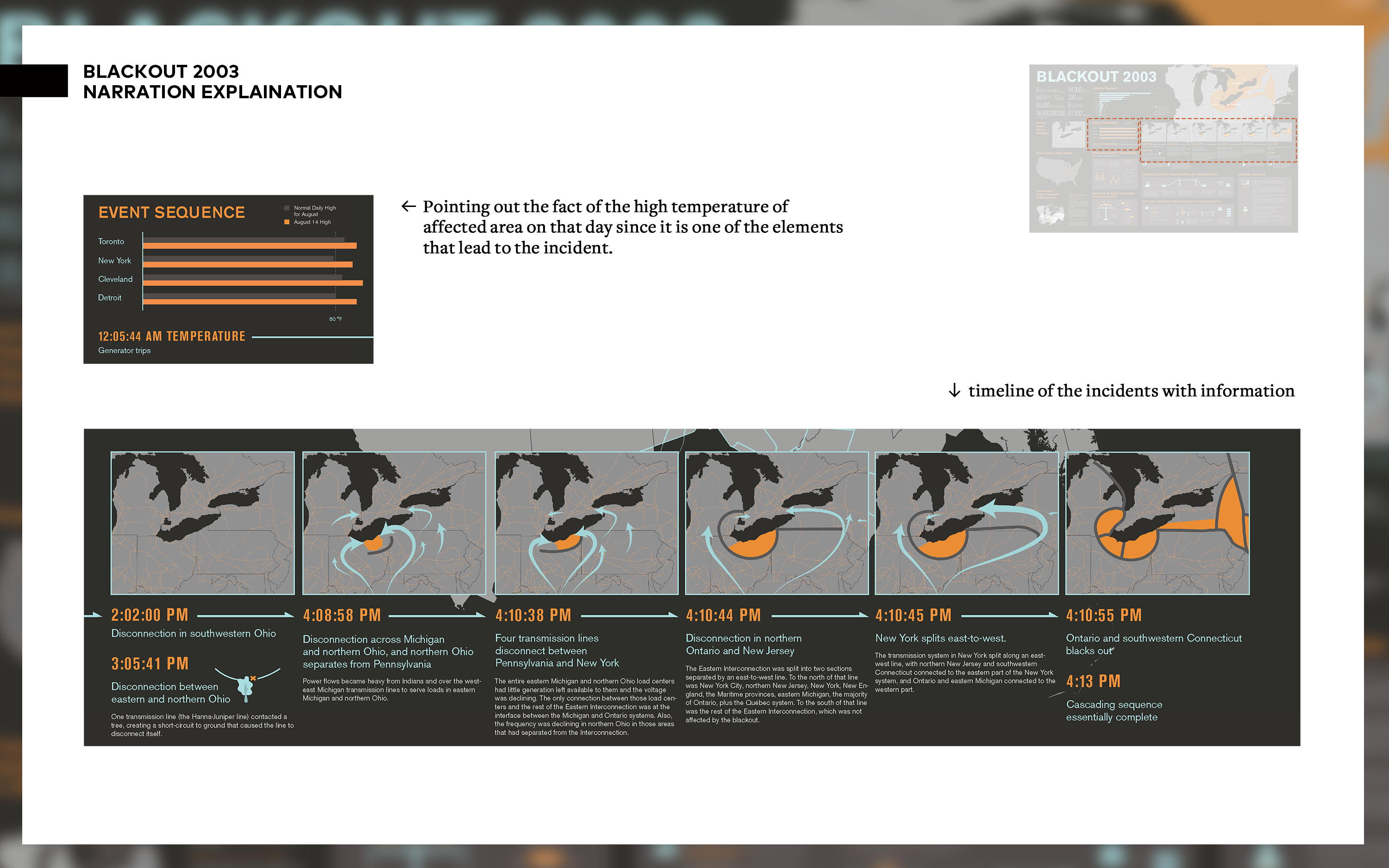
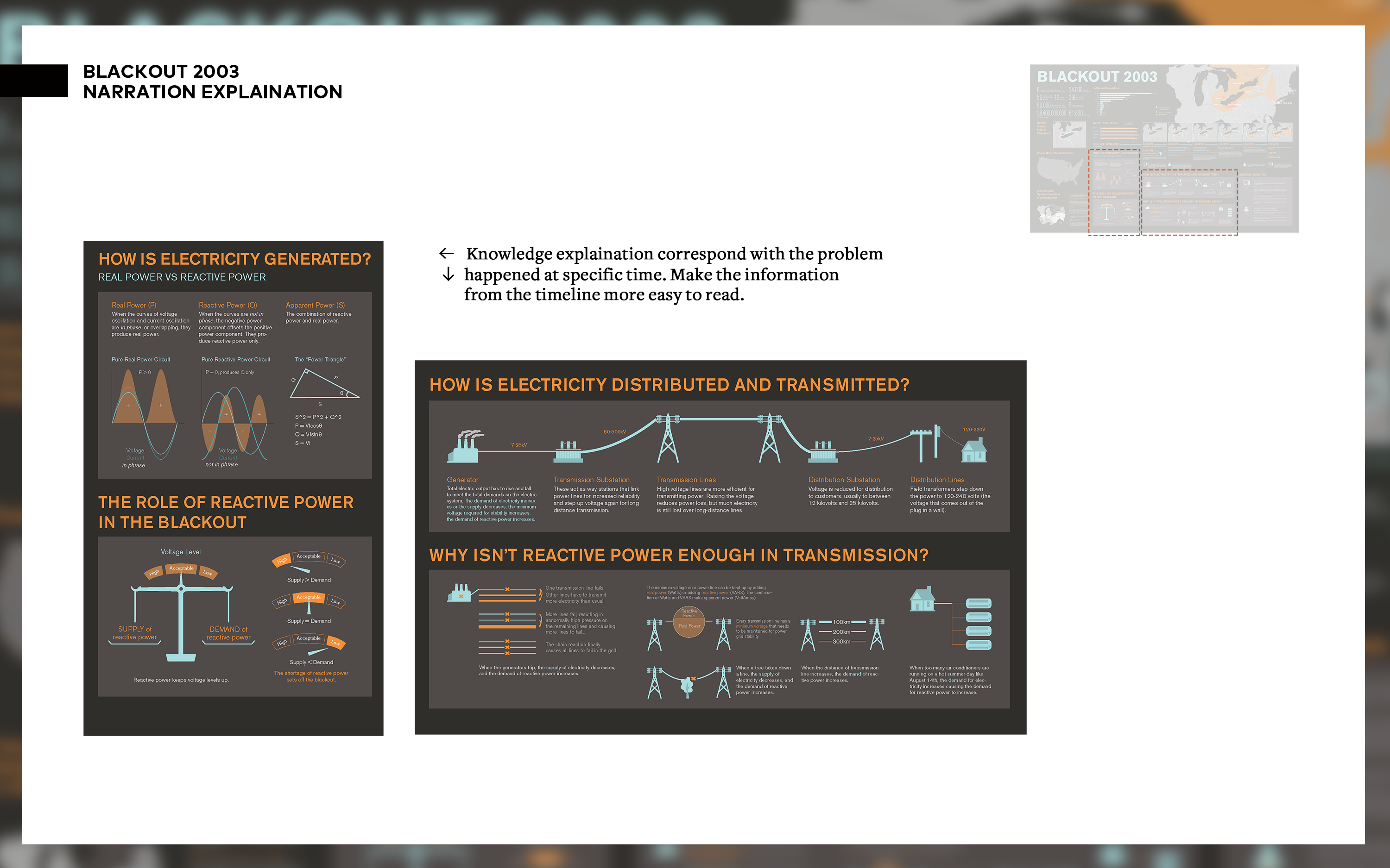
Then by providing some information of the electricity in the US, the sequence of the event is brought up with timeline and knowledge explanations-like electricity distribution, real power vs reactive power, etc-under each relevant time.
The small maps show how the blackout blocks the transmission of the electricity and makes the transmission becomes difficult and requires a longer and longer distance throughout the whole event.
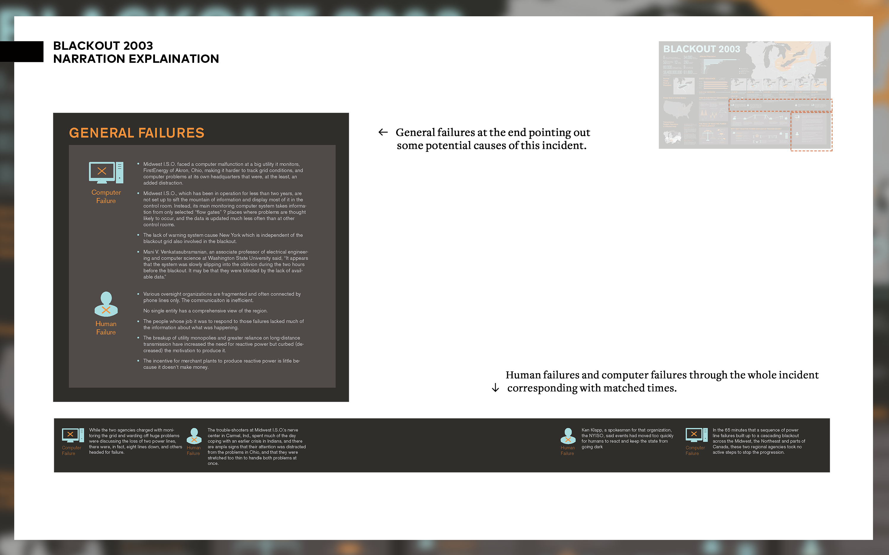
Also, some computer failures and human failures are connected to relevant time and also there are general failures posted in the right corner.
The idea of color palette comes from the darkness the blackout brought to people (dark grey), the electricity (light blue) and the light (orange).
The infographic provides overall results of the event first. It begins with a large title “Blackout 2003” with big data, a bar graph of the affected population, and the final affected areas as the results of this incident.
Then by providing some information of the electricity in the US, the sequence of the event is brought up with timeline and knowledge explanations-like electricity distribution, real power vs reactive power, etc-under each relevant time.
The small maps show how the blackout blocks the transmission of the electricity and makes the transmission becomes difficult and requires a longer and longer distance throughout the whole event.
Also, some computer failures and human failures are connected to relevant time and also there are general failures posted in the right corner.
The idea of color palette comes from the darkness the blackout brought to people (dark grey), the electricity (light blue) and the light (orange).
*Click on the image to see it in high-resolution on a full-screen size.